

The Petition for Plastic People is now on-line:
http://www.petitiononline.com/PP2010/petition.html Please take 30 seconds to fill it out and support the club.
Here are 2 top ten lists from the classic sessions at Plastic. Friday's Blueprint Sessions and Saturday's Balance Sessions:
Friday Night Blueprint Session Tracklist:
- John Coltrane – My Favourite Things
- 4 Hero – Hold it Down (Bugz in the Attic Remix)
- Tania Maria – Come With Me Now
- Mos Def – Universal Magnetic
- Spacek – Eve (Nwachukwu Remix)
- Nwachukwu – The Way
- Attica Blues – What Do You Want (King Britt Remix)
- Love Unlimited Orchestra – Strange Games and Things
- TNT Featuring Terri Walker – Easy Loving You
- Vikter Dupliax – Messages
- Dego – This Aint Tom and Jerry
Saturday Night Balance Tracklist:
- Donald Byrd – Dominoes
- Pepe Braddock – Burning
- Marvin Gaye – What's Going On
- Antonio Adolfo – Cascavel
- Wayne Shorter – Ponta De Areia
- Pharoah Sanders – You've Got to Have Freedom
- Mos Def – Universal Magnetic
- Larry Young – Turn Off The Lights
- Manzel – Space Funk
- Leon Thomas – It's My Life I'm Fighting For
- Incognito – Fearless

This venue will always be close to my heart. Please follow the updates on the group
Facebook Page.Thought I'd resurrect some words written by Charlie Dark and myself. Written last year for
Floor to WallFOREWORD by Charlie Dark.
Before we begin this discussion let me make this confession. I was not the one from my crew who discovered Plastic People. That honour goes to my good friend and fellow DJ, Acyde who I met back in 1995 in another hallowed hall of music, The Blue Note in Hoxton Square. Home to legendary club nights such as Goldie’s Metalheadz and Mo Wax’s Dusted. A space where sound system and music policy took precedence over the clothes worn and faces on the door. The demise of the Blue Note left a hole in London club life that the slew of clubs that followed in its wake all failed to fill. Since its closure new clubs and bars sprung up in the area proclaiming great things, but ultimately falling short of the benchmark set. With no place to go out and rave, many faces disappeared never to be seen again.
So when news filtered through about this wicked new space that had opened in Shoreditch, I rolled down to Curtain Road with Acyde to meet the owner and check it out. On first impressions there was nothing to shout about. The grey door gave no indication of the delights that lay behind it, but when Ade finally turned up and led us downstairs into the depths of the club all fears were put to rest. As a veteran of the orbital rave and inner city warehouse scene, I’ve learnt that good clubs begin with a journey, a sense of anticipation climaxing in the discovery of the dance floor. Factor in a pencil thin entrance, steep stairs and a basement devoid of light and I was sold before I even heard the system. Hands were shaken, dates booked and our new night was born.
In a deliberate attempt to go against the grain we dispensed with flyers altogether, hoping word of mouth would fill our space like the clubs of old. Relenting only to small black and white business cards from the three-pound machine in the market to spread the word. With a DJ line up consisting of friends and fellow producers, our Sunday session ticked along quite nicely until enthusiasm died and it suddenly ground to a halt. Surprisingly, or maybe because he couldn’t find anyone else, Ade then asked me to spin at his legendary Saturday night ‘Balance’.
I’ve always had a fascination with flyers. Even before I was old enough to hit the town I would hoard them in old trainer boxes in my bedroom. Once my DJ career took off and my name started appearing on them I was even more diligent with my collection, carefully sticking them into scrapbooks as I charted my career. What impressed me most about the Plastic People flyers was the attention to detail and the subtle references that only became apparent when they’d been stuck to the studio walls for a couple of months. The fact that they rarely stated the music policy or boasted about the size of the sound system also made them stand out and saved them from having the roaches ripped out of the corner. Instead they took pride of place in a collection straining at the seams. But the thing that really caught my eye were the hand-drawn illustrations, the landmarks referenced in an ever-changing city that informed the very music pumping through the speakers. If you trace the flyers in this book from beginning to end you will soon see patterns developing within the names that graced the turntables. Warm-up DJs elevated to peak time draw. Old stalwarts switching genres. Hallowed masters who rarely played our shores pitching up and rocking well into
the morning.
When Ade asked Tony Nwachukwu and myself to do a night at the club we jumped at the chance, excited at the prospect of having a space to develop a regular following and sound. It was our first and only residency and I will always thank Ade for taking a chance and offering us the opportunity. After the demise of our album deal with Sony and the bitter experiences of dealing with the music industry, the Blueprint Sessions were a statement of independence. A chance to play the latest productions alongside the wealth of music that influenced their grooves. The guest DJ line up was a testament to this and again the flyers had an important role to play. Traditionally clubs would make a different flyer for every night but Ade was adamant that it was one flyer a month or nothing. His logic being that if you picked up a flyer and saw the names of all of the guests who were playing you were more likely to come to at least one session. We went back and forth, but in typical Ade fashion he refused to back down. I was still apprehensive until I saw the flyer for the night. With priority given to the names alongside the images, Ali Augur's flyers became a call to arms. If you were a true music head, if you really loved music and the new sounds sweeping across London, then for the next three months we were going to bring you its finest exponents. It worked and the club was rammed, with many people attending each and every session, some even driving from across the country to catch their favourite DJ.
But like all things, it came to an end. When my daughter Naima was born the lure of the late night to the break of dawn session lost its appeal. Specially when you knew you’d be waking up in two hours for the early morning feed. I still play at Plastic on occasion and often drop in when someone interesting is in the booth, but to be honest my regular attendance is waning. Now thanks to Ali, I can stay in with my feet up while the kids use me as a trampoline, flick through the flyers and remember.
Charlie Dark
INTRODUCTION by Ali Augur
Flyers by their nature are throwaway things. As soon as they’ve left the printers, they don’t get the love and attention they deserve. Stuffed into drunken punters’ hands, wedged under wobbly bar tables, or stuffed into the corners of record shops to gather dust. Most end-up in gutters, rather than adorning bedroom walls.
Advertising had taught me some nifty tricks over the years; “The big idea”, “Keep it simple” and “Three’s a campaign” are all rules that I had started to adopt in my work. Rules which, when applied to the humble club flyer make for powerful work. I was fortunate enough to be introduced to a club and its owner in 1998 that would allow me to test these rules and play out my ideas. Ade Fakile’s Plastic People was a basement space on Oxford Street, with an incomparable sound system playing a jaw-dropping selection of music. It was an intimate and friendly space, free from the pretensions usually associated with clubs and unlike anything I had experienced before.
Our first meeting was in the downstairs bar of The Phoenix Theatre on Charing Cross Road. It became a regular place to talk and thrash out ideas. The first meetings were tricky, particularly as Ade made it clear he didn’t believe in promotion, marketing, flyers or branding. But we shared a love of music and common goals. He was as passionate about producing a quality club night as I was about producing a quality flyer. This was enough for us to start working together.
Early on, we played up the cheesiness of the club’s Oxford Street location. Real clubbers didn’t go near the West End on a Saturday night. I dug out some old Letraset books in search of Seventies clipart and found some great poses. I loved that they could be so kitsch, while also looking iconic and graphic – the Plastic People logo was born. Rather than throw away the other found images, we decided to run them all
as flyers.
We went one step further and actually produced the flyers as proper rub-downs, complete with blue backing paper, possibly making them the most expensive club flyers ever. Only a few hundred were produced, with the second batch being printed on tracing paper.
I had borrowed heavily from the much-revered Letraset and I was now keen to focus on producing my own imagery for future work.
I had a passion for London and the everyday stuff people took for granted. These seemingly banal scenes took on a new feeling when captured in illustration and put on a flyer. I enjoyed picking them out and championing them. Soul Jazz records on Ingestre Place and Brick Lane Bagels were the first of these illustrations. Typically for London’s club scene, just as I had got started, the club faced closure. At least the choice of imagery for the final flyer was clear; Ade behind the washing machines which supported the decks, with Jon Lucien’s ‘Would You Believe in Me’ and Donald Byrd’s ‘Dominoes’ sleeves on view.
While Ade searched London for a new space, I had time to take stock and start thinking about a new (hopefully uninterrupted) series. On reflection, there were things that bugged me with the first series; the colours didn’t work well together as a family, the typography was clunky and there were elements that didn’t need to be there. By the time the new Curtain Road space had opened its doors I knew exactly what I wanted to do.
The new space was found and was due to open in April 2000. For a while, the new club was going to be called Wasp. I spent a few weeks developing a logo and look, but Ade eventually stuck with Plastic People. So in a similar way to the Letraset work, we had a set of discarded images that we were keen to use. Wasp was finally used on a Friday gig, featuring Ashley Beadle and guests.
The clubs cornerstone was the Balance session on a Saturday night. In its reincarnation on Old Street, Ade brought in Lee Hefner and Jason Swinscoe as weekly residents. The first image was a drawing of BT Tower, drawn from Tottenham Court Road. Seven more followed in the series, my favourite being the image of The Barbican. I love it as its one of my favourite London landmarks, plus the line-up was outstanding. Like the artwork, the nights were evolving and getting stronger.
The towers had become too obvious. I wanted to continue with a recognizable theme but in a more subtle way. The underground seat pattern was the solution. You have to appreciate they were done ‘pre-digital’, with no Google or digital cameras. I would take to the Underground with a notebook, scribbling down a section of pattern like it was some sort of code, then return to the Mac to translate it in Illustrator.
During this campaign, we decided to transfer two of the most familiar patterns onto large 6ft long canvases and put them on the wall by the bar. People subconsciously liked the patterns for their familiarity. I got a lot of enjoyment watching the punters trying to work them out. A couple of years later, the power of these patterns were finally realised and they could be seen across a variety of products, from sofas to socks.
The patterns were great fun and could have gone on for longer than they did, but I decided to switch it. The last series was a return to architecture and places. I was interested in stripping all the words and logos from these environments and placing the dancing people logo in their place. It seemed the right thing to do, especially as the flip-side of my working life was spent in Adland.
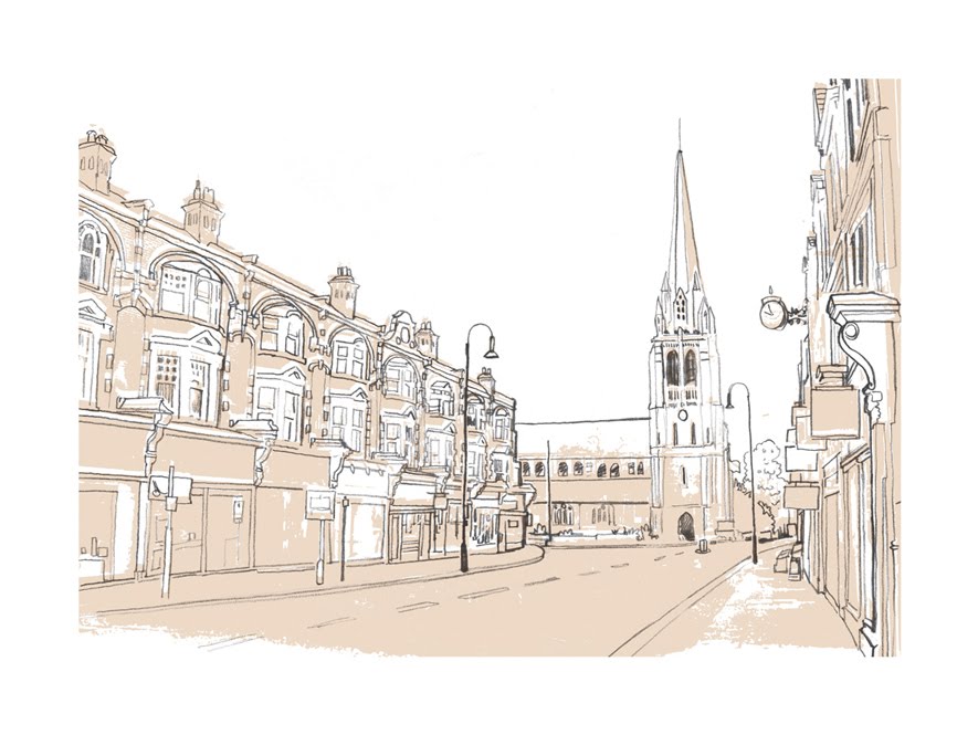
I suppose the choice of imagery was a selfish one. If I liked it, I drew it. From the Bingo Hall on Essex Road to the Rainbow in Finsbury Park. All north of the river and close to my heart. Ten years on, they look even more evocative due to the ever-shifting London landscape. The October image of Charing Cross Road and The Astoria - complete with Routemaster - is a good example.
As well as the Balance flyers, I did a lot of one-offs and flyers for Friday nights. The Blueprint Sessions was like the younger sibling to its brother Balance, with some great nights and guests. The 3 Chairs, Gilles vs Abdul, Quasimoto and Reggae Nights all being favourites.
Looking back at the work as a collection revives a lot of good memories, and over time, it’s been great hearing from people who collected or remembered the flyers. The thought of even a few of them making it to a bedroom wall or two makes it all worthwhile.
Ali Augur


